[go: up one dir, main page]

Gdoc/Admin

Popular pages

Research and data to make progress against the world’s largest problems.

Read about our mission

Data Insights

Bite-sized insights on how the world is changing, published every few days.

See all Data Insights
This is a line graph depicting the global gender gap in primary school enrollment from 1900 to 2023. The vertical axis represents the percentage of primary school-age children enrolled in primary education, ranging from 0% to 100%. The horizontal axis shows the years from 1900 to 2023. 

There are two lines on the graph: one represents girls, shown in green, and the other represents boys, shown in purple. In 1900, about 31% of boys and 23% of girls were enrolled in primary education. The lines gradually rise, reflecting an increase in enrollment over time. By 2023, the enrollment rates are nearly equal, with 91% of boys and 89% of girls enrolled. 

Text annotations on the graph highlight the key statistics for 2023 and 1900. The data sources for the information presented are the UNESCO Institute for Statistics (2025) and the study by Lee and Lee (2016). The image is credited to Our World in Data and is licensed under CC BY.

A century of progress in access to primary education

The world has made major progress in expanding access to education. A century ago, most children did not have the option to go to school at all. Today, access to education is widely seen as a basic right that governments are expected to provide. And most governments succeed — according to statistics compiled by UNESCO, about 9 in 10 children of primary school age are enrolled.

The chart shows how this expansion unfolded for boys and girls separately. Throughout most of the 20th century, enrollment rose steadily, but boys remained more likely to be in school than girls. It was only towards the end of the century that this gap began to close. Today, the gap is small: around 91% of boys and 89% of girls are enrolled in primary school.

While the gap is small globally, it remains large and persistent in some countries. In Chad, in Central Africa, about 80% of boys are enrolled in primary school, compared with 67% of girls. This difference has shown little change in recent years, as the data linked below shows.

Explore enrollment gender gaps for all countries and across education levels.
Continue reading
The global number of maternal deaths has more than halved. Line chart titled "Estimated annual number of women who die from maternal conditions," showing a steady decline in estimated annual maternal deaths worldwide from about 625,000 in 1985 to about 260,000 in 2023, with a small uptick around 2020 due to the COVID-19 pandemic before falling again. Data source: World Health Organization - Global Health Observatory (2025). Chart licensed CC BY to Our World in Data.

Maternal deaths have more than halved in the last forty years

A woman dying when she is giving birth to her child is one of the greatest tragedies imaginable.

Every year, 260,000 women die from pregnancy-related causes. This number rose to 322,000 during the COVID-19 pandemic.

Fortunately, the world has made continuous progress, and such tragic deaths have become much rarer, as the chart shows. The WHO has published data since 1985. Since then, the number of maternal deaths has more than halved.

Explore data on the number of maternal deaths, country by country.
Continue reading
This data visualization presents a bar graph illustrating the number of deaths in Bangladesh from storm events over the years, prominently featuring significant cyclone incidents. The vertical axis represents the number of deaths, ranging from 0 to over 300,000, while the horizontal axis spans from 1960 to 2023.

Key data points highlighted include:

- More than 300,000 deaths noted during the 1970 Bhola cyclone, categorized as a Category 3 cyclone.
- In 1991, 138,000 deaths occurred from a Category 4 cyclone.
- In 1985, 15,000 deaths were reported from a Category 3 cyclone.
- The year 2007 saw only 4,000 deaths from a Category 4 cyclone.
- Since 2007, no year has recorded more than 200 deaths, even with several Category 4 and 5 cyclones.

A note emphasizes that estimates before 1971 are based on deaths that occurred within Bangladesh's current borders. The data sources for the graph are EM-DAT, CRED, and UCLouvain, from the year 2024. The image is attrib uted to the "Our World in Data" project.

Bangladesh has become much more resilient to cyclones, saving many lives

In 1970, Cyclone Bhola hit Bangladesh, killing more than 300,000 people. It was a strong cyclone, but not unprecedented. What made it so deadly was the lack of any early detection systems, alarms, or mass evacuation procedures. A huge storm surged into a densely populated area, and hundreds of thousands of people drowned in their homes.

Since then, Bangladesh has become much more resilient to these events. The chart shows the country's annual death toll from storms, stretching back to 1960.

Throughout the 1980s and early 1990s, a few large events claimed many lives. But in recent decades, the death toll has been low. That’s despite Bangladesh experiencing some extremely powerful cyclones. Cyclone Amphan (2020) and Mocha (2023) were both Category 5 — the strongest rating.

Bangladesh offers one of the clearest examples of how humans are not helpless in the face of “natural” disasters: investments in weather forecasting, early warning systems, and proper evacuation procedures can protect communities and save lives.

This development is part of a longer-term and widespread success in reducing humanity’s vulnerability to storms, floods, earthquakes, and other hazards. Read more in my article.
Continue reading
A bar graph illustrates the sales trends of internal combustion engine cars and electric cars in China from 2010 to 2024. The bars representing internal combustion engine cars are shown in shades of purple and dominate the graph, with a peak reaching around 25 million units in 2017. This peak is indicated with an arrow and labeled "Sales peaked in 2017." After 2017, the sales of internal combustion engine cars decrease slightly while electric car sales, represented by green bars, show a rapid increase in recent years, particularly noticeable in the later years of the chart. The y-axis indicates sales figures ranging from 0 to 25 million, while the x-axis is labeled with the years from 2010 to 2024. At the bottom, the data source is cited as the International Energy Agency, Global EV Outlook 2025, with a CC BY license.

China’s internal combustion car sales peaked in 2017 as electric vehicles took off

Electric cars have become incredibly popular in China. In 2020, one in eighteen new cars sold was electric. By 2024, this had increased to one in two.

This growth has pushed down sales of internal combustion engine (ICE) cars, which run mostly on petrol. As you can see in the chart, sales of ICE cars peaked in 2017 and have declined since.

The world reached peak ICE car sales just one year later.

The displacement of petrol cars with electric ones is vital in decarbonizing transport. The rise of electric vehicles in China means the IEA expects oil demand to peak earlier than previously projected.

Here, “electric cars” include fully battery-electric ones and plug-in hybrids. In China, 56% of them were fully battery-electric.

Track data on the evolution of electric cars across the world
Continue reading

From 5% to 76% in 30 years: Kenya has made substantial progress in providing access to electricity

Those with access to electricity take many of its benefits for granted: food refrigeration reduces waste, the radio can keep us company during the day, and light at night makes it possible to study or get together after sunset.

According to data published by the World Bank, 30 years ago, only 5% of people in Kenya had access to basic electricity and its benefits.

Since then, the country has made substantial progress, as the chart shows: by 2023, 76% of Kenyans had access to a basic electricity supply.

Explore our world map and charts of the share of the population with access to electricity.
Continue reading
The image presents a line graph illustrating the average height of men by decade of birth, ranging from the year 1710 to 1980. The vertical axis indicates height in centimeters, with increments at 5 cm, from 160 cm to 185 cm. The graph features three lines representing three countries: Denmark, Netherlands, and Germany, each with distinct colors. The data points show a significant upward trend in height over the decades, particularly noticeable after 1900. The data source for the information presented is Baten and Blum from the year 2014, and the graph is published under a Creative Commons Attribution license.

Over many generations, better nutrition and lower disease have led to people becoming taller

Poor nutrition and illness can limit human growth, so long-term improvements in living conditions are often reflected in increases in average height.

At the individual level, height depends on many other factors, but genetics plays a particularly important role. Not all short people are undernourished or sick, and not all tall people are necessarily healthy. However, when we look at population averages across generations, broad patterns in nutrition and disease burden can play a visible role.

This is why historians often use height as an indirect measure of living conditions. By examining historical changes in height, researchers can gain insights into living standards during periods when little or no other data is available.

This chart presents estimates from Jörg Baten and Matthias Blum, published in the European Review of Economic History (2014). The lines show the average height of men by decade of birth in Denmark, the Netherlands, and Germany, from 1710 to 1980.

For the earlier period, the estimates are based mainly on military conscription records (which measured young men eligible for service), so they are not fully representative of the entire population.

These historical data points are less representative than modern survey data, but the changes are large enough that the overall pattern is meaningful even if exact levels carry some uncertainty.

The chart shows how rapidly average height rose in these countries during the 20th century, a trend consistent with major improvements in health and nutrition.

Explore historical height data from the same source for other countries
Continue reading
A world map shows the distribution of reported cases of guinea worm disease in 2024. Two countries are highlighted in darker shades: Chad, which has nine reported cases, and South Sudan, which has six reported cases. The rest of the map, particularly surrounding regions, is light-colored and marked as having no reported cases. The caption notes that there were only 15 reported cases globally and mentions that guinea worm disease is still endemic in three other countries. The data is sourced from the World Health Organization, with a note explaining that the disease is caused by a parasitic worm spread through contaminated water.

Only two countries recorded human cases of guinea worm disease in 2024

Guinea worm is an incredibly painful and debilitating disease; one that’s hard to imagine unless you’ve seen someone suffer from it.

As we explain in a dedicated article, it’s caused by the guinea worm parasite, whose larvae can be found in stagnant water. Drinking contaminated water lets the larvae enter the stomach and intestines. These grow into adult worms, getting into their joints and causing arthritic conditions, before emerging painfully through the skin.

The good news is that the world is extremely close to eradicating this disease. In 1989, more than 890,000 human cases were recorded globally, compared to only 15 in 2024.

As you can see in the map, these cases were recorded in just two countries: Chad and South Sudan.

There are three other countries — Ethiopia, Angola, and Mali — where guinea worm is still endemic (meaning it’s still considered present there), but they reported no new cases in 2024.

Here, we focus on guinea worm cases in humans, but it’s important to note that other animals — such as domestic dogs — can also be infected. This adds further challenges to eradicating the disease completely.

Explore more data on neglected tropical diseases, which we recently updated
Continue reading

Explore our data

Featured data from our collection of 13,781 interactive charts.

See all our data

What share of children die before their fifth birthday?

What could be more tragic than the death of a young child? Child mortality, the death of children under the age of five, is still extremely common in our world today.

The historical data makes clear that it doesn’t have to be this way: it is possible for societies to protect their children and reduce child mortality to very low rates. For child mortality to reach low levels, many things have to go right at the same time: good healthcare, good nutrition, clean water and sanitation, maternal health, and high living standards. We can, therefore, think of child mortality as a proxy indicator of a country’s living conditions.

The chart shows our long-run data on child mortality, which allows you to see how child mortality has changed in countries around the world.

Explore the data
Explore the data

Share of population living in extreme povertyWorld Bank

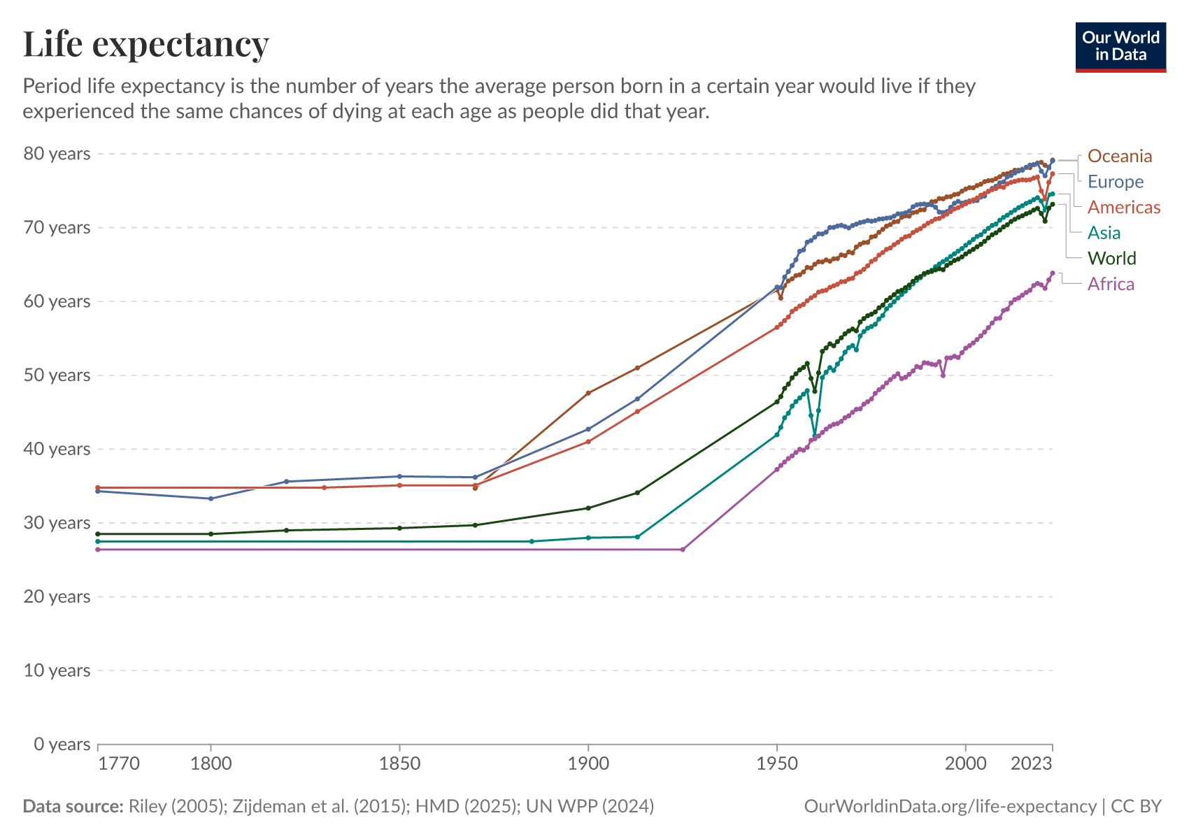
Life expectancyLong-run estimates collated from multiple sources by Our World in Data

CO₂ emissions per capitaLong-run estimates from the Global Carbon Budget

GDP per capitaLong-run estimates from the Maddison Project Database

Share of people who are undernourishedUN FAO

Literacy rateLong-run estimates collated from multiple sources by Our World in Data

Share of the population with access to electricityWorld Bank

Data explorers

See all our Data Explorers

Interactive visualization tools to explore a wide range of related indicators.

All our topics

All our data, research, and writing — topic by topic.

Population and Demographic Change

Health

Energy and Environment

Food and Agriculture

Poverty and Economic Development

Education and Knowledge

Innovation and Technological Change

Living Conditions, Community and Wellbeing

Human Rights and Democracy

Violence and War