Category
All Things Brand

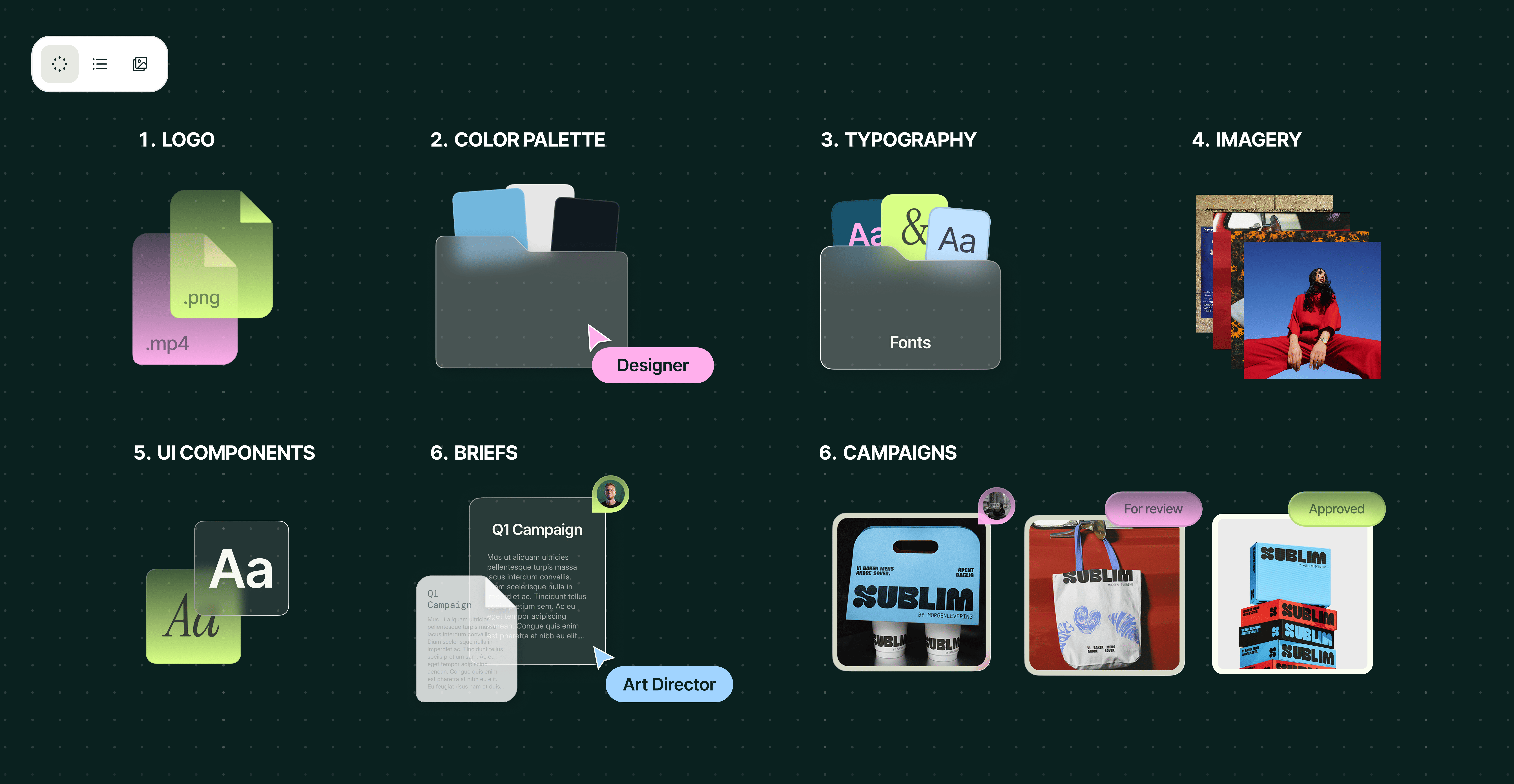
9 professional presentation design services: scaling decks in 2026
Presentations are often where important ideas meet the people who can move them forward: a sales story that resonates with an important customer, a business idea that lands with an investor or a strategy that makes the C-suite sit up and take notice. Yet many enterprise teams still build most high-stakes decks themselves. They lose hours to formatting, wrestle with charts and animations, then pull outdated slides into new decks, often because they simply don't have the in-house design skills or capacity.
15 brand awareness campaign examples that made millions care
The best brand awareness campaigns tap into a feeling, a behavior or a cultural insight. Nike made motivation feel like a three-word personal challenge. Coca-Cola turned packaging into an invitation. Each brand took a different route, but both gave people a reason to remember the brand behind the feeling.
The best AI brand kit generators of 2026 (& where enterprise brands outgrow them)
An AI-generated brand kit might work when your team creates a handful of assets. But once you're working across several channels, markets and hundreds of AI-assisted outputs, the kit stops being enough. What begins as a fast, affordable way to launch your brand quickly becomes difficult to manage, update and apply consistently at scale. The good news is that AI brand kit generators have real value. They're excellent for new businesses, early concepts and contained projects. The bad news? Fast-scaling and enterprise brands eventually need more.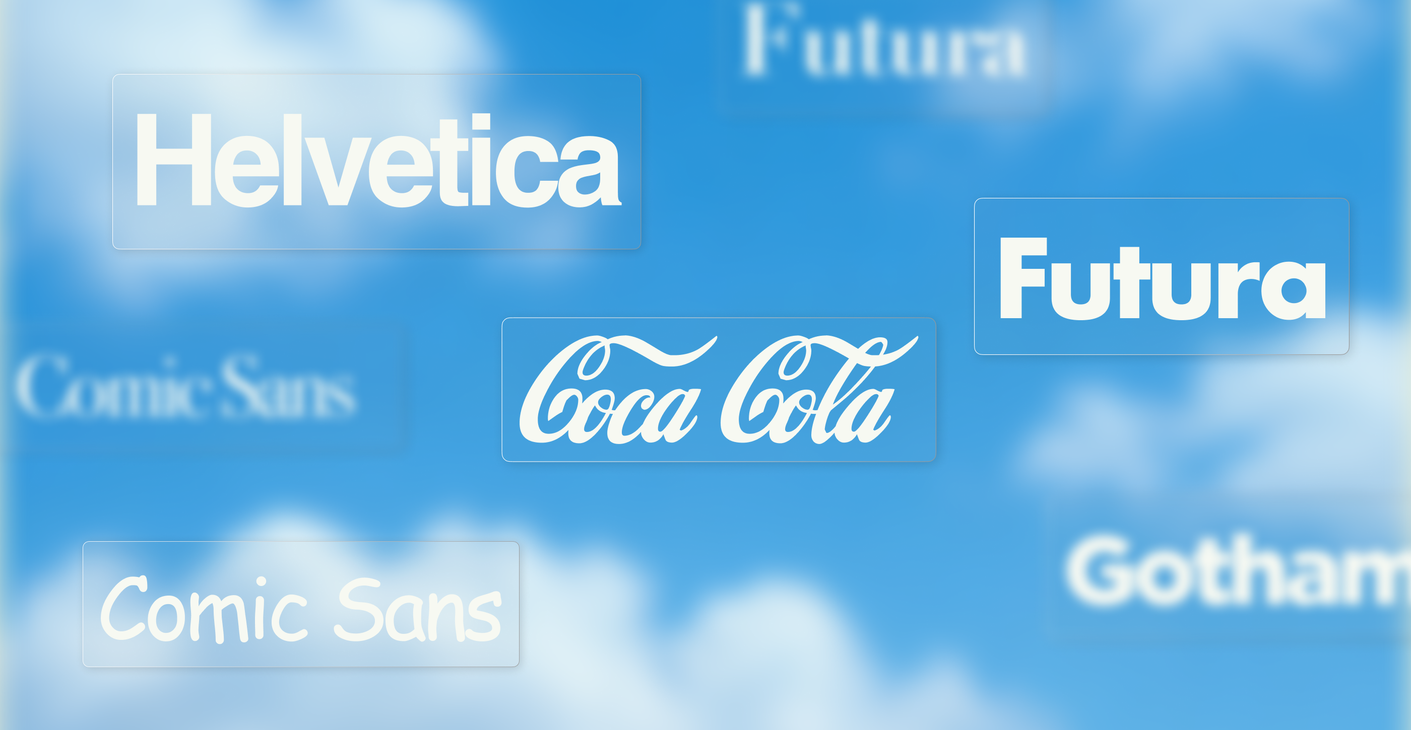
The most famous fonts and iconic typefaces of all time (2026)
Type is everywhere, hiding in plain sight. You know the shape of a letter long before you'd ever think to name its font. The Coca-Cola script, the Netflix wordmark, even the Futura etched onto the Apollo 11 plaque on the Moon. On this page, we cover what makes each font iconic, who designed it and where you've seen it, split into timeless classics and modern brand fonts. We also look at why the world's biggest brands now commission their own typefaces, and how that same craft scales into enterprise design systems.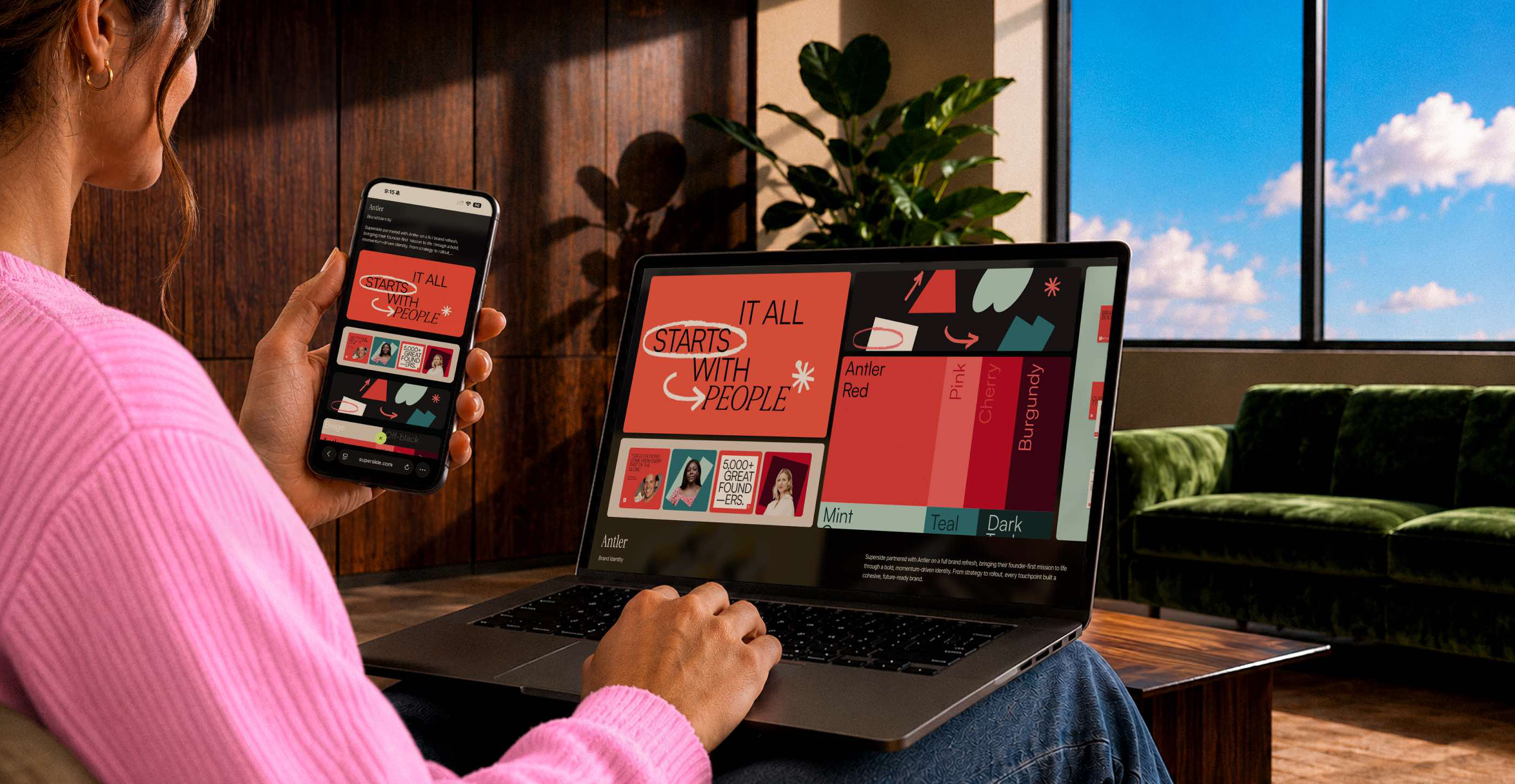
How to measure a rebrand: the metrics, framework & proof that it worked
The new logo design lands. The website goes live. The launch video is shared. Then everyone has an opinion, and before you know it, the CEO asks, "Did the rebrand work?" For many marketing leaders, that's when the scramble starts. Without a pre-launch baseline or measurement plan, they can report what launched, but not whether the rebrand actually changed brand awareness, public perception or business performance.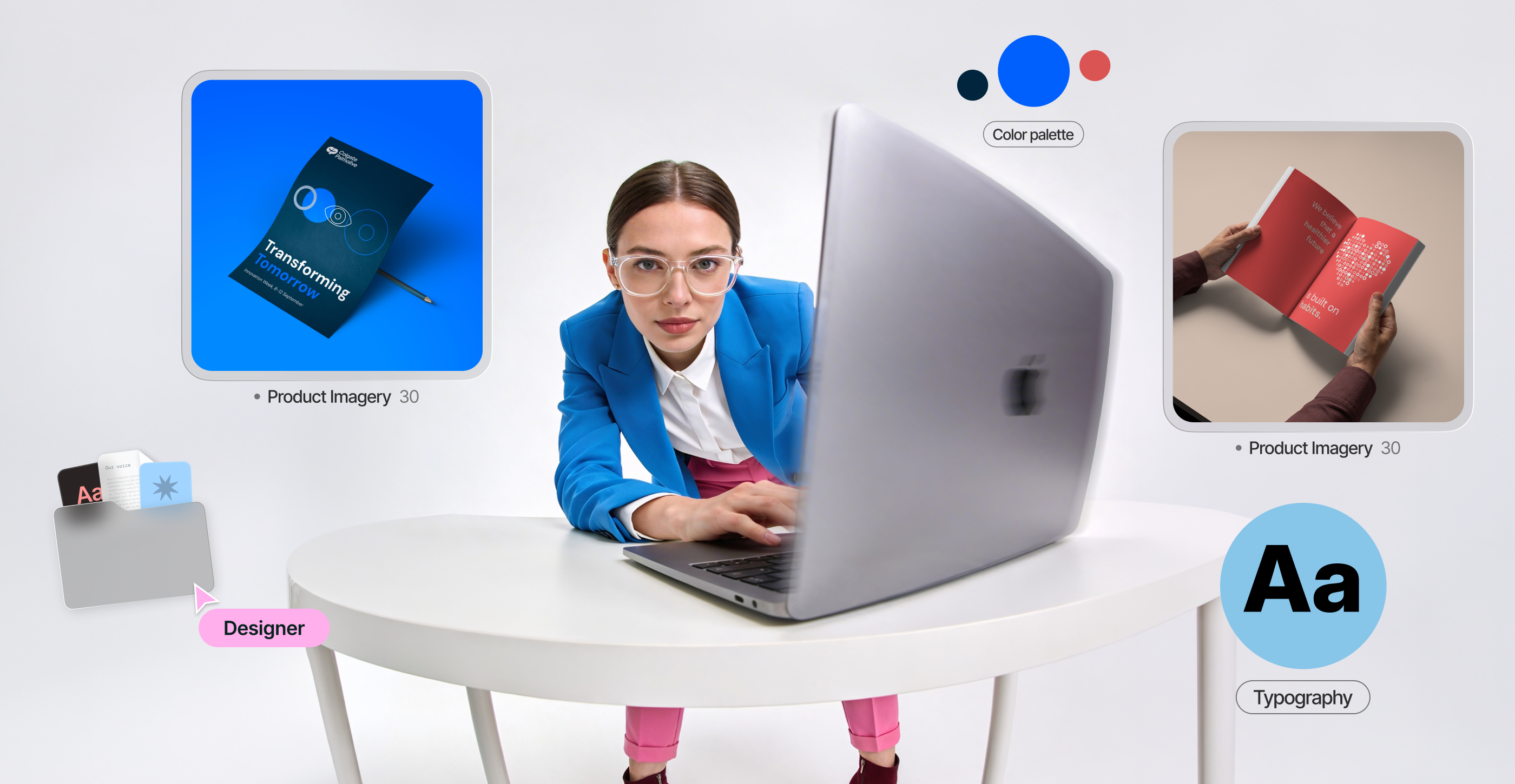
Brand architecture: models, strategy and real examples in 2026
Brand architecture starts with a simple question: how should our brands relate to each other? The answer determines whether products share the parent brand's reputation or stand alone, and whether new launches build on existing brand equity or start from scratch. Ultimately, it shapes whether audiences see a clear, connected portfolio or a collection of unrelated brands.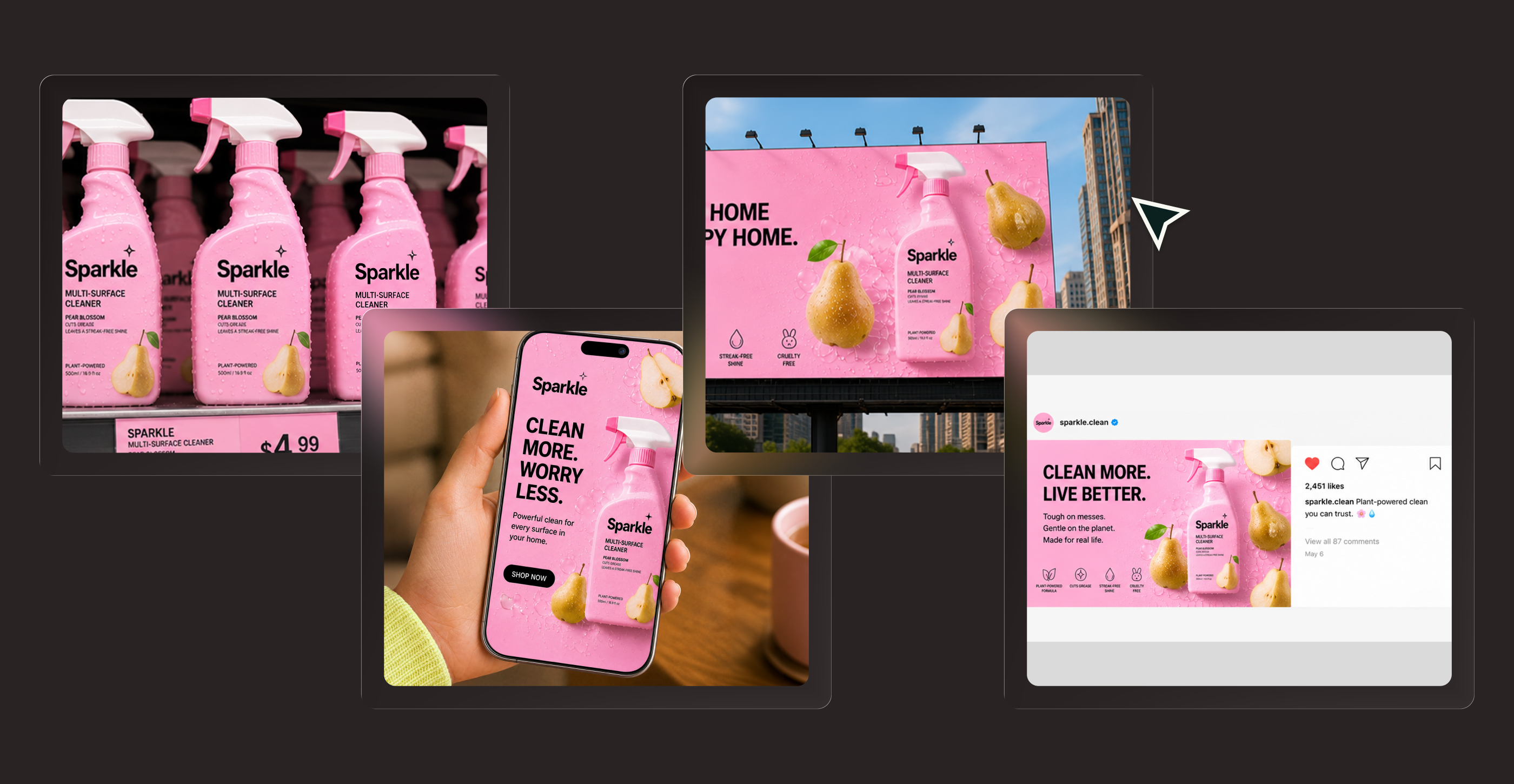
CPG branding beyond the package & how consumer brands win at scale
In consumer packaged goods, branding is often treated as a packaging exercise. Yet packaging is only the jacket a product wears, its most visible expression rather than the full story. As private-label ranges expand and shoppers encounter brands across shelves and screens, an attractive pack alone is unlikely to create lasting preference. The brands that stand out in 2026 build trust, loyalty and scale with coherent brand systems that express the same distinctive character at every touchpoint.