1Contemporary Cream
 William Abranowicz
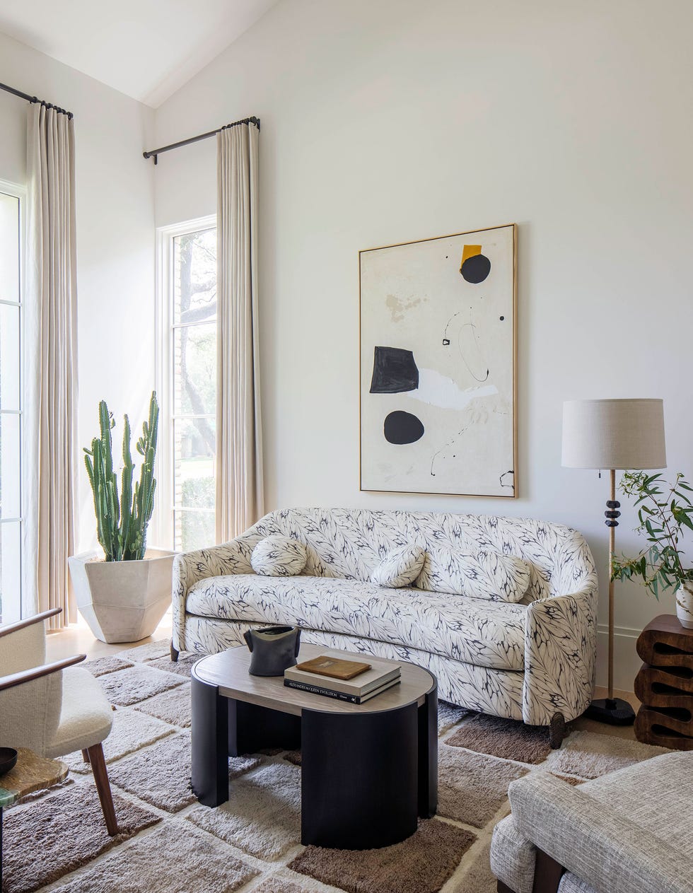
In this proudly pared-back living room, designer Chad Dorsey worked primarily in a palette of cream in the furnishings, walls, artwork, and accessories. The trick to banishing the “blahs”? Adding pattern, texture, and contemporary silhouettes throughout, like the feathery print on the sofa and the varying pile on the Rug Company rug.
2Taupe Tones
 Frank Frances
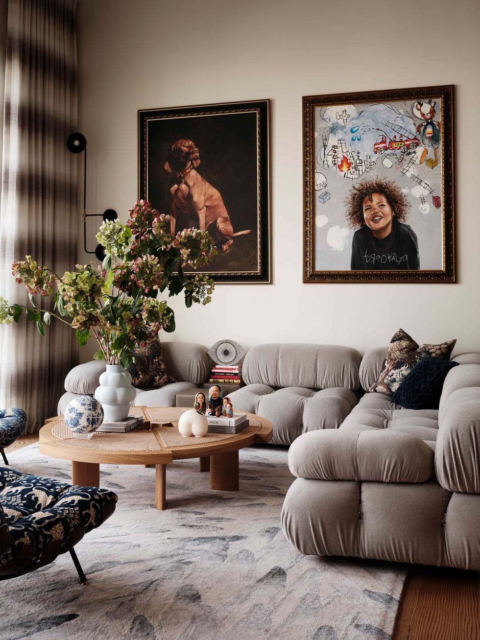
Can’t commit? Play with a spectrum of your favorite neutral, like designer Eva Bradley did in her classic San Francisco Victorian. Here, she proves that taupe can contain multitudes when executed properly, as with the classic Mario Bellini sofa and the ombré striped curtains.
Advertisement - Continue Reading Below
3Elegant Neutrals
 Noe DeWitt
“Usually, we do like a fair amount of color,” the client of this deliciously neutral Upper East Side apartment told us. “But in New York, it felt right that the palette should be more subdued.” ELLE DECOR A-List design firm Redd Kaihoi embraced the brief with gusto—with its own maximalist inflections. Here, a classic palette of cream and beige gets sun-kissed with complementary materials like bronze, brass, and gilt wood.
4Scenic and Serene Neutrals
 Photographer: Roger Davies
If the idea of a blank, beige wall gives you nightmares, opt for an elegant hand-painted mural or scenic wallpaper. By doing so in her own New York apartment, the late design legend Suzanne Rheinstein created a bucolic oasis in the heart of a concrete jungle.
Advertisement - Continue Reading Below
5Neutral Spectrum
 Chris Mottalini
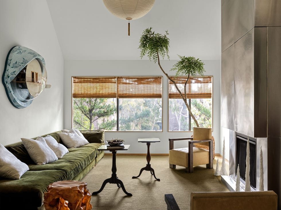
Design experts have long been calling for an expanded definition of neutral, and this California residence, designed by Andre Herrero of the studio Charlap Hyman & Herrero, is an ultra-cool example. Here, warm beiges live side by side with bright white, olive green, and even stainless steel in a scheme that’s easy on the eyes—in more ways than one, judging by that surreal wall sculpture!
6Bold Yet Neutral
 Chris Mottalini
Black and white aren’t necessarily shorthand for cozy, but as ELLE DECOR A-List designer Alfredo Paredes proves, the duo makes for the perfect après ski pairing. In this Vermont alpine retreat, he painted the entire living room white, save for the chimney breast, which he covered in a jet black Venetian plaster. Not only does it create a focal point, “It feels more modern and kind of like an exclamation point against the slopes,” Paredes told us.
Advertisement - Continue Reading Below
7Moody Neutral
 Brittany Ambridge
Did you know that prospective homebuyers will shell out more for a home painted in moody charcoals and grays? Even if you’re not putting your house on the market anytime soon, it’s a helluva chic scheme, especially in the hands of celeb designer Jeremiah Brent. Here in the lounge of his New York office, the walls, ceilings, and window treatments were all doused in an ash paint color. Black velvet armchairs, a bold marble mantel, and a gilt mirror add enigmatic luxe.
8Farmhouse Palette
 Pieter Estersohn
If you’re like the majority of Americans and adore a modern farmhouse look, go for a neutral variation. Here, in a New York country house, ELLE DECOR A-List designer David Netto artfully mixed antique furniture of various eras with folksy fabrics and silhouettes in complementary tones. Bonus points for the painted ceiling!
Advertisement - Continue Reading Below
9Nature’s Neutral
 Douglas Friedman
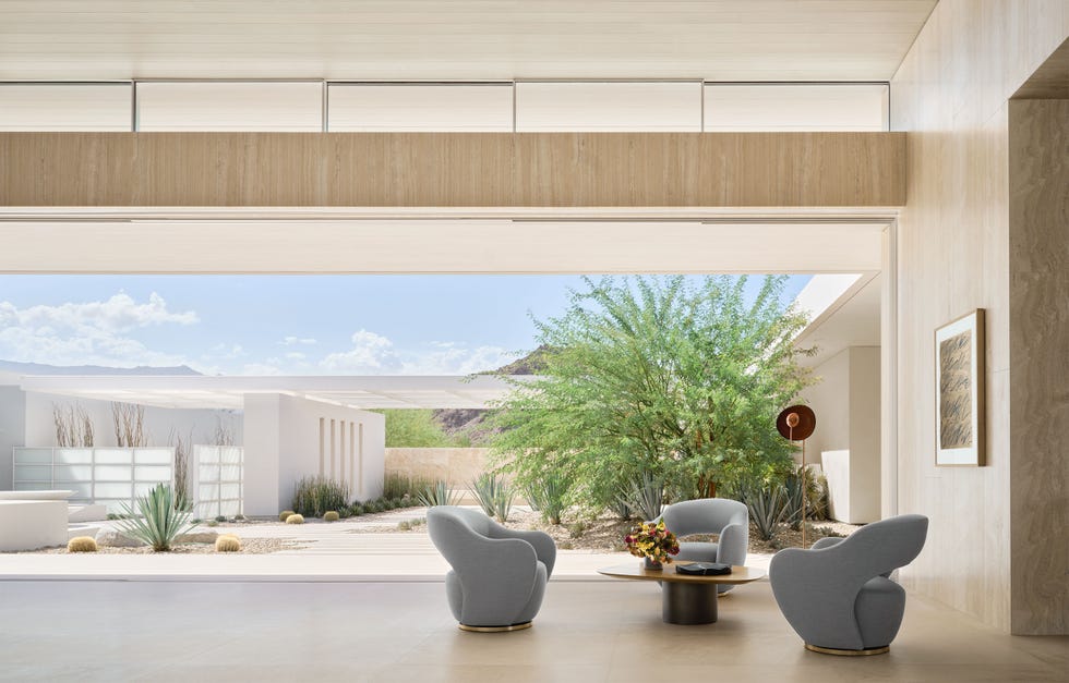
If you’ve got a view as stunning as this, Mother Nature’s already done the heavy lifting as far as color is concerned. ELLE DECOR A-List designer Nicole Hollis embraced the surrounding dessert landscape in this epic retreat, which relies on an ultra-pared-back palette of travertine, bleached oak, and limestone.
10Off-White Oasis
 Joshua McHugh
This serene space, in a New York City home designed by Alyssa Kapito, is a master class in artful all-white layers. Multiple seating areas—in soft whites, of course—create a perfect environment for entertaining, while a plaster chandelier by Eric Schmitt “gives this lovely glow and a sense of architecture,” per Kapito.
Advertisement - Continue Reading Below
11Earthy Neutrals
 Photography by Winnie Au
As an alternative to flat or glossy paint, give lime wash a try. The trending texture lends a sense of cavelike warmth, or in the case of this Brooklyn apartment by Office of Tangible Space, the feeling of living “in an acorn.”
12Graceful Ivory
 Tim Lenz
This refined living room, the handiwork of Augusta Hoffman, shows off the designer’s easy mix of contemporary silhouettes and weightier wood antiques. “We decided to embrace [timber’s] materiality and use it as a contrast to the surrounding spaces,” Hoffman says. “With that, we had to make cognizant choices to make the rest of the space feel bright and open so that the dark wood tone didn’t overpower everything.”
Advertisement - Continue Reading Below
13Patterned Neutral
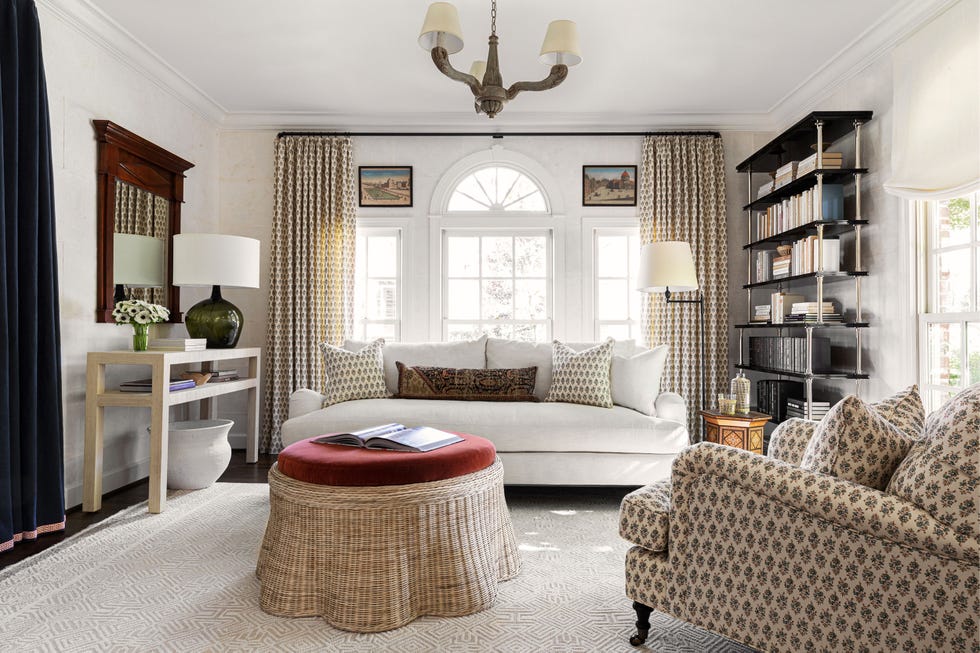 Stephen Pagano
If you crave patterns in your neutral space, go for it! Just make sure they’re in a complementary tone and motif. David Netto protégé Lily Dierkes used a Namay Samay fabric in this Nashville residence. The scalloped wicker ottoman adds texture.
14Laid-Back Ranch
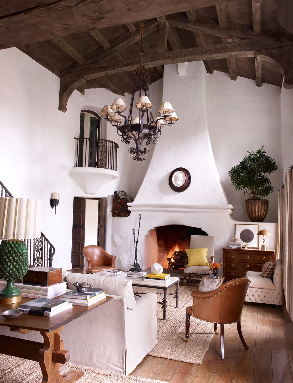 William Waldron
Traditional gets a twist in Reese Witherspoon’s Ojai, California, ranch. Designer and friend Kristen Buckingham, who had experience designing other Spanish-style homes, created a living room that felt “fresh and youthful” with linen slip covers, leather and wood furnishings, and a soft white-washed paint job.
Advertisement - Continue Reading Below
15Neutral With a Pop of Color
 Ryann Ford
Just because you seek a neutral look doesn’t mean you have to abandon regional flourishes—or your taste for fun furnishings. We love this renovated Austin ranch home designed by architect Paul Lamb, with its adobe walls and modern sofa and chairs.
16Traditional Gray and Cream
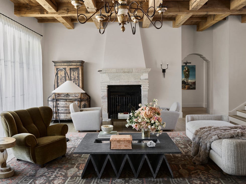 Douglas Friedman
This Sonoma, California, estate might be a new build (the previous house was destroyed by a wildfire), but designer Ken Fulk incorporated plenty of cozy, old-world touches—including the 19th-century stone mantel, which was imported from Italy. Unconventional shapes and outsize silhouettes, as with the Jane Hallworth cocktail table, bring the look back into the present day.
Advertisement - Continue Reading Below
17Stone Centerpiece
 David Mitchell
Balance out your neutral living room with deeper tones. Designer Tim Godbold grounded this room with a deep blue carpet, a move that draws the towering stone fireplace into the scheme.
18Unexpected Ombré
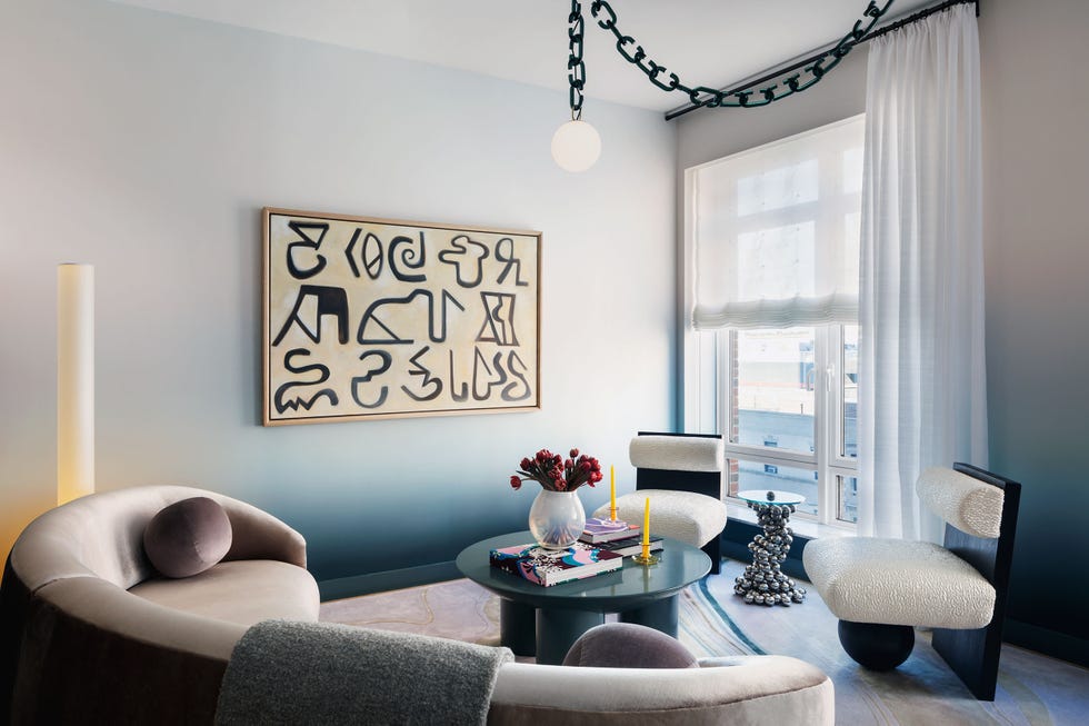 Colin Miller
Think outside the box when it comes to the neutral living room of your dreams. Here, in a Manhattan model unit, ELLE DECOR A-List designer Rodney Lawrence specified a sunriselike gradient wallpaper to create a mood that soothes.
Advertisement - Continue Reading Below
19Grounded Neutral
 Frank Frances Studio
To keep your neutral scheme from catching a case of the blahs, play with shapes. Here, in a Brooklyn apartment by Ishka Designs, circular silhouettes are repeated in the rug, cocktail table, lamp, and fireplace. “We love the principle of a circle,” says firm partner Niya Bascom. “There’s no beginning, no middle, no end—only constant growth.”
20A Pop of Olive
 Stephen Kent Johnson
Don’t be afraid to treat green like a neutral. After all, as Pantone’s Leatrice Eiseman tells us, “Mother Nature uses it ubiquitously in plants and foliage.” The designers at Ashe Leandro seemed to have taken that advice to heart, as shown in this Manhattan living room where the curvaceous olive-green sofa is a seductive inflection point in an otherwise neutral room.

Anna Fixsen is the deputy digital editor of ELLE DECOR, where she oversees all facets of ElleDecor.com. In addition to editing articles and developing digital strategy, she writes about the world’s most beautiful homes, reviews the chicest products (from the best cocktail tables to cute but practical gifts), and reports on the most exciting trends in design and architecture. Since graduating from Columbia Journalism School, she’s spent the past decade as an editor at Architectural Digest, Metropolis, and Architectural Record and has written for outlets including the New York Times, Dwell, and more.
Advertisement - Continue Reading Below
Advertisement - Continue Reading Below
Advertisement - Continue Reading Below


